September 23, 2016 — By WPTouch Admin

WPtouch Pro Theme Update: Bauhaus 2.0!

bauhaus-2_4-phones
Today we released a major update to our flagship and most popular theme, Bauhaus. In 2.0, you can now choose between different layouts, starting with our new carousel view.

Carousel View

3
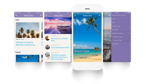
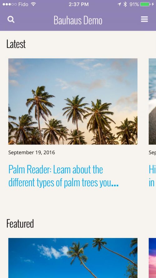
In Carousel View you can show an infinite horizontal carousel which loads your posts chronologically, allowing visitors quick access to your entire post content history in a single page view.

You can also choose to show Featured Posts, and Popular Posts carousels as well.

Visitors have dozens and dozens of posts available at their fingertips instantly with Bauhaus 2.

6Full-Bleed Carousel

Want your beautiful featured images to be showcased in full-bleed? No problem. Bauhaus 2 allows you to showcase your posts in an infinite loading horizontal carousel view, filling the display of your visitor’s mobile device. The smooth, kinetic carousel lets your visitors browse your content in an immersive, engaging and unique way.

1List View

Bauhaus 2 also still supports its standard list view, which showcases your posts vertically, with an optional featured posts carousel above— which has been updated both under the hood to be more performant and with a refreshed look and feel.

List view is perfect if you don’t use featured images, or have a mix of content types.

Smart Loading

Across the board in all layouts we’ve enhanced lazy loading of both posts and images, making significant speed and performance improvements.


Available Today

Bauhaus 2.0 is a free update for all existing customers, and included with every bundle of WPtouch Pro.

May 31, 2013 — By WPTouch Admin

We’ve Got a New Look!

Welcome!

A big part of the focus in launching WPtouch Pro 3 was ensuring you have access to the very best support and find helpful product information quickly. We put these goals front and center when considering and planning the direction of our new website. We’ve streamlined and updated every corner of our website, refreshing content and design to provide a better experience for customers, visitors, agencies and developers.

New Support Services and Ticketing System

We love knowing our customers appreciate the effort we put into providing great customer care. Through BraveNewCode Support, our customer support team is available Monday to Friday from 9am to 5pm PST, ready to respond to requests for assistance and offering help, documentation, tutorials and other resources.

With the release of WPtouch Pro 3.0, we took the opportunity to introduce customer enhancements to make our support experience even better. The new BraveNewCode Support website uses tickets so that customers have access to direct, timely, private support.

We also have an improved customer dashboard designed to make it even easier for customers to locate information, downloads, and receive the help they’re looking for.

New Product Pages

How much faster will my site load with WPtouch Pro? What is Web-App Mode? Is my native language one of the 22 languages supported by WPtouch Pro? Find out the answers to these questions and more on our new WPtouch Pro product pages.

We believe WPtouch is the best mobile solution for WordPress websites but don’t take our word for it. Check out our new product page to read feedback submitted by WPtouch Pro customers and find out all about WPtouch Pro 3’s awesome new features.

A New Look and New Ideas

While we remain true to our goals of providing excellent products and great customer care, we’ve got a fresh new look and a ton of new ideas to share with you. Ideas aimed at making it easy for you to create and customize the very best mobile browsing experience for your site visitors and clients.

Check out the new www.bravenewcode.com and let us know what you think.

December 11, 2012 — By WPTouch Admin

Why Top Internet Brands Choose Server-side Mobile Solutions [White Paper]

Responsive Design Versus Server-side Solutions

If you are serious about providing a fast and well-formatted multi-device experience for your site visitors think server-side solutions.

The average size of a web page in 2012 is now 1249 KB, up 40% year-over-year, according to httparchive.org. Assuming this trend continues, average page sizes in 2014 will be over 2 MB-four times larger than average page sizes in 2010. Unfortunately the method of mobile web design, commonly called responsive design, is not adequately positioned to reverse this trend; in reality, it is likely to significantly add to average web page sizes.

In contrast, server-side solutions leverage the benefits of detecting mobile device types like phones and tablets in order to deliver a fast and dependable mobile-optimized web experience.

Download our white paper, co-published by Mobile Joomla!, to find out more about the benefits of choosing server-side solutions.

White Paper: Why Top Internet Brands Choose Server-side Solutions Over Responsive Design, Web Quality (2MB)

White Paper: Why Top Internet Brands Choose Server-side Solutions Over Responsive Design, Print Quality (10MB)

December 3, 2012 — By WPTouch Admin

Responsive Design Versus Server-side Mobile Solutions [Infographic]

If the average mobile user is only willing to wait a maximum of four seconds for content to load on their devices, it makes no sense to use an approach that may slow down your site’s loading time.

Yet some are choosing to use responsive design for their websites – a method by which both desktop computers and mobile devices always download an entire web page, along with its added code.

The statistics in our new infographic show why we believe the better choice for many high-traffic, large-volume sites is a fast and flexible server-side solution.

Copy the code below to embed this infographic into your web page:


<a href="http://www.bravenewcode.com/?p=14216"><img src="http://www.mobilejoomla.com/media/press/responsive-vs-serverside/Responsive-Design-vs-Server-Side-Solutions-Infographic.jpg" title="Infographics: Responsive Design vs. Server-Side Solutions" alt="Infographics: Responsive Design vs. Server-Side Solutions" /></a>

November 5, 2012 — By WPTouch Admin

Responsive Design vs. Server-Side Mobile Solutions with BraveNewCode and Mobile Joomla [Dev1.tv Podcast]

Responsive Vs. ServerSide Mobile Solutions

Recently our Co-Founder Dale Mugford along with Ugur Kaner and Miikka Kukkusuo from Mobile Joomla were interviewed for a podcast on Dev1.tv.

The podcast focuses on comparing responsive design with server-side mobile solutions, sometimes referred to as “dynamic serving” – like Mobile Joomla and our WPtouch plugin. A summary of points discussed during the podcast can be found below.

The differences between responsive design techniques and server-side approaches can be broken down into four categories:

Technical
A significant benefit of server-side solutions is fast and efficient delivery of content. This is a key consideration for mobile users who studies show are only willing wait 4 seconds for content to display on smartphones. Server-side solutions are designed to deliver mobile pages that are up to 500% smaller than the size of their desktop counterparts and load up to 400x faster. In comparison, heavy webpages slowed by responsive techniques can exceed mobile device cache limits, resulting in an increased risk of crashing your browser. Server-side solutions can also swap out larger images and videos for smaller ones and prevent extraneous scripts and assets from being sent entirely— characteristics which are not technically possible in responsive approaches at this time.

Design
Server side solutions leave less room for content formatting requirements to be overlooked. This ensures a polished, dependable design is displayed to site visitors. However, server-side solutions can require additional work to maintain branding across devices. Responsive design’s single set of styles ensures consistent design is applied in all cases, perhaps its strongest benefit.

Content
With responsive design, content which is inappropriate for mobile visitors is only ‘hidden’ through stylesheet formatting. With server-side solutions, site owners can specify content that will not be sent to mobile visitors, further streamlining and optimizing the mobile display of content.

Maintenance
Best practices for responsive design are still being determined. Finding a designer with a strong enough grasp of both mobile technologies and mobile design skills to be able to deliver a dependable responsive design may not be easy and is often expensive. Similarly, maintaining a responsive design on an ongoing basis may mean reliance on expert design support. In contrast, many server-side solutions are set up to be user friendly for the site owner. Ongoing updates and changes can be applied through an easy-to-use interface.

You can listen to the full Dev1.tv “Responsive Design vs. Alternate Mobile Solutions” podcast here.

Further reading:

About BraveNewCode and Mobile Joomla

Mobile experts on the BraveNewCode and Mobile Joomla teams have each been developing mobile solutions for over 5 years. BraveNewCode co-founders, Dale Mugford and Duane Storey, are developers of WPtouch, the most popular mobile solution for WordPress sites. First released in 2008, WPtouch has been downloaded over 3,700,000 times from the WordPress directory and is used by over 30% of the top blogs using WordPress. Ugur Kaner is the founder and developer of Mobile Joomla and Miikka Kukkusuo is head of business development for Mobile Joomla. Mobile Joomla is most popular mobile solution for Joomla websites. Mobile Joomla currently delivers over 15,000,000 mobile Joomla pages. The two teams combined serve a sizeable share of sites using open source CMS mobile solutions and stand behind server-side detection as a best practice for mobile content delivery.

Previous Blog Entries

Added To Cart

Item added to cart successfully. You can either continue browsing and add more themes or extensions, or checkout now.

View Cart Checkout