November 6, 2014 — By WPTouch Admin

Choose custom web fonts with the Advanced Typography extension – new with WPtouch Pro 3.6

We carefully select the typefaces to be included in WPtouch Pro’s web font pairings to express a wide variety of personalities that might be appropriate for sites using WPtouch Pro. Although they work for many websites, some site owners have contacted us asking how they can choose their own web fonts from the wide range offered by Google Fonts – or even use fonts from subscription font services. Still others need access to the varied character subsets available through Google Fonts for languages that use cyrillic, greek, or even devangari. To all of you, we are delighted to say: easily, with a few clicks, today. And most importantly: FREE with all WPtouch Pro licenses!

font-pickers

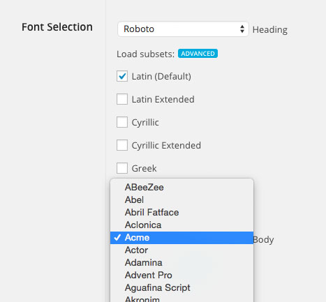
Picking custom fonts with the Advanced Typography extension

With support for the full Google Font library as well as your custom sets from Fontdeck and Typekit, Advanced Typography for WPtouch Pro 3 puts you in complete control of the typographical branding of your website. We’re excited to be able to put this level of fine control in your hands and can’t wait to see what you do with it. Other great new features in WPtouch Pro 3.6 include:

  • More powerful URL filters – select pages that WPtouch Pro ignores or have just a few pages of your website displayed with the WPtouch Pro theme.
  • Web App Mode startup screens for iPhone 6 and 6+.
  • Disable JetPack Jetpack modules (related posts, sharing buttons, like box) when deselected in the plugin compatibility tool.
  • Added fine control of various features, including post type selection for the featured slider, better RTL support, improved gallery handling, and more!

Get started with WPtouch Pro 3.6 by upgrading through the WordPress admin, downloading a copy from the WPtouch Support site, or purchasing your WPtouch Pro license today!

June 26, 2014 — By WPTouch Admin

Increase Revenue with Multi-Ads, A New Extension For WPtouch

Many of our WPtouch Pro customers are interested in generating revenue from their mobile sites. Even as far back as WPtouch Pro 2.0, we’ve included the ability to have one advertising unit on the page in a user-specified location. As more and more advertising services have adopted mobile-friendly advertising formats, we’ve been repeatedly asked lately to include additional options, such as the ability to display multiple different advertising units on each mobile page.

ad-top2

Introducing Multi-Ads

As such, we are pleased to announce the release of a new WPtouch Pro extension: Multi-Ads. Multi-Ads includes the ability to have up to four advertising units on each page, each independently targeted to a different sub-set of content pages. For example, advertisement units near the header could be configured to only be included on archive pages, which advertisements near the post content could be configured to show on every page. These options are fully configurable by the site administrator for each advertising unit.

Multi-Ads Extension for WPtouch

Multi-Ads Extension for WPtouch

Each advertising unit in Multi-Ads is service-agnostic – use whichever service or code you want by simply adding your adverting JS or HTML code for each unit.

In addition, we’ve included the ability to A/B test for each advertising location to help our customers maximize their site revenue. Using this feature, a website owner could specify two different advertising units for each location to determine which unit produces the most revenue. We expect this feature will be used immediately to help our WPtouch Pro customers produce additional advertising revenue from their sites.

A/B Testing in Multi-Ads Extension

A/B Testing in Multi-Ads Extension

Multi-Ads can be installed starting today from the Extension Browser within WPtouch Pro by all Small Business, Agency, and Enterprise customers.

January 16, 2014 — By WPTouch Admin

Responsive Images Now in WPtouch Pro

The web community at large has struggled with delivering responsive images (different sized images that are served based on a device’s screen size).

Current State of Responsive Images

The holy grail (so to speak) of the responsive design movement lay in having the HTML spec ratified to support having devices do the work of determining which image size is most suitable to download and fetching it instead of a larger one. This would be done (in proposal) via css, or the IMG HTML tag. The advantage of this would be that small devices wouldn’t request large images, nor would they download multiple images.

However, this is what currently occurs on responsively designed sites & templates. The only way to prevent it, currently, is to only serve one large size of an image, and penalize small mobile devices by making them have to download the largest asset and just scaling it down via css to appear smaller.

Responsive Images Extension

responsive images

Publish your content and give us your best quality image— we’ll do the rest. With WPtouch Pro 3.1’s Responsive Images extension, you don’t have to define alternates or set a single setting to ensure the right sized images are being served to the right devices. The extension works to crunch images you upload and, on the fly, determine what size a device is, and which image is best suited for it and sends it along instead.

Automatic, ‘Set It and Forget It’

This means even devices like the iPhone 3GS and iPhone 5 will receive different sized images, ensuring the trade-off between high fidelity images and reduced bandwidth is negotiated. The Responsive Images extension handles all of the image size negotiation and device type negotiation automatically, with zero configuration required.

Moving forward, we’ll go beyond uploaded content to WordPress websites, and instead any image you link to in a WordPress post or page is the correct size for the device that’s requesting a page view.

responsive imagesLeveraging our BraveNewCloud, we’ll make sure any linked image has more appropriate sizes cached and ready for you to serve to your mobile visitors. This means if you link to images anywhere else on the Internet, we’ll make sure that image isn’t too large for the device requesting it.

We believe delivering Responsive Images for WordPress websites shouldn’t be difficult for the average user. We wanted the ability to support Responsive Images to be as simple as adding links to images in a post or page and clicking publish.

With Responsive Images in WPtouch Pro 3.1, that’s exactly what you do.

WPtouch Pro 3.1 is a free update for all existing customers. You can update to 3.1 through the WordPress admin panel like any other plugin on the plugins page.

In WPtouch Pro 3.1, we’ve introduced our own extensions, and 3 new extensions are currently available to customers: Mobile Content (for replacing desktop content with mobile content on the fly), Infinity Cache (for caching both mobile & desktop), and now Responsive Images (for serving the right sized images for the right device).

Previous Blog Entries

Added To Cart

Item added to cart successfully. You can either continue browsing and add more themes or extensions, or checkout now.

View Cart Checkout